Ode to my color map
I love colormaps. The “Choosing Colormaps in Matplotlib” guide is practically my homepage. There’s a certain elegance to the act of taking a range of numbers, dividing that range into equal increments and assigning each increment a color. It’s quantitative and intuitive, yet leaves room for preference and personality. I am a fan of ‘inferno’, but some days I feel more like ‘magma’, and I can see why some prefer ‘viridis’ entirely. And then there’s ‘jet’. We don’t talk about ‘jet’.
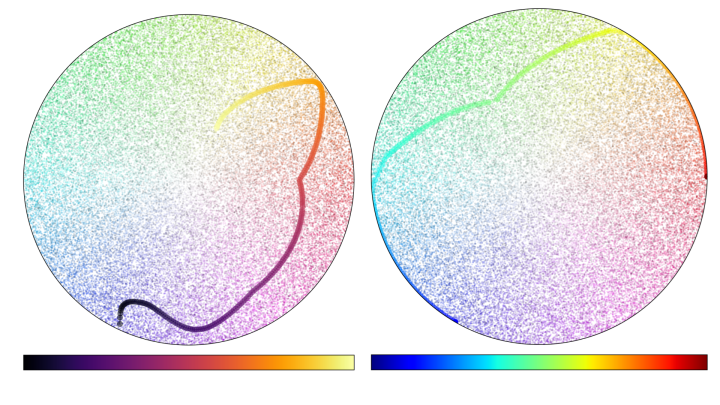
The sequential, perceptually uniform colormap is a compelling invention that deserves a permanent exhibit at the Museum of Modern Art. It has the illusory quality that even if you remove all the hue and make it monochrome, you can still tell which direction is increasing. The range of luminance levels maps to the range of primate visual perception.
A colormap can enrich a story by anchoring the value mapping to our shared experience or symbolism, such as a blue-red diverging colormap that represents temperature or American politics.
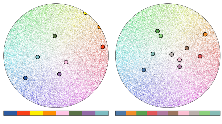
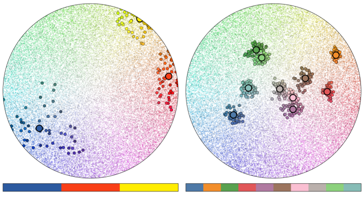
For all my waxing poetic on the nuance of colormaps, I’ve noticed that we tend to behave with less intention when we apply color to categories. We represent categorical data by lumping all of the in-category datapoints together with the exact same hue. We try to maintain the distinctiveness of colors while choosing a visually pleasing palette. However, by reducing the total number of distinct colors used in a graphic to the total number of discrete categories visualized, we only take advantage of a small sample of the visual spectrum.
That may not be a huge problem for a small number of points, but in a world with bigger and more complicated datasets, this can easily result in overplotting, where points from within the same group blend together and cannot be easily distinguished. The good folks over at Datashader have done a great job outlining the problem of over-plotting in their article on “Plotting Pitfalls”, as well as a useful solution to it.
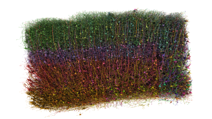
While there are many ways to avoid overplotting, such as rasterization or visualizing distributions, there are some instances when we really would like to plot all the points. So, I’m taking a different approach by suggesting we can be more liberal with our boundaries when applying colors to categories.
We already have a technique at our disposal to add randomness along an encoding axis that is widely used, accepted, and expected: jitter. I think that we should be more comfortable applying it to color, too.
Jitter: applying randomness to a categorical encoding channel for perceptual clarity
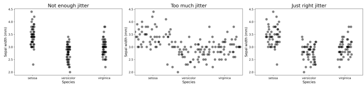
Let’s consider a basic categorical scatterplot, and plug in some toy data—the iris dataset. Let’s consider the visual encoding in this example.
By convention, the independent variable is shown on the y-axis; the position of the points are encoded by their position in the y-dimension of the graphic. The category or grouping variable is encoded along the x-axis. Most plotting software automatically adds ‘jitter’: positional randomness along the categorical axis to avoid overlapping of the points, and ensure that they can be distinguished from each other. Great plotting software even lets you specify how much jitter you want.
Although the x-dimension is already encoding a categorical variable in the data, it is best practice to add some randomness to this dimension for perceptual clarity. And for good reason! If we explore the edge cases we see when we use too little jitter, we can’t distinguish the points. If we use too much jitter, we negate the visual encoding along that axis entirely.
When we then want to use both x- and y- positions to encode different variables within the data, we instead use color to encode the category. The common practice is to assign each category a color, and color all the points of that category exactly the same way. This effectively applies the equivalent of our extreme ‘not enough jitter’ example above.
Applying jitter to color
Jitter can also be applied to color. Without it, overplotting can happen, leading to blobs of saturated pixels in an image where we can’t discriminate between points. When color jitter is too high, you may see the overall distributions—but the color category of some points is ambiguous.
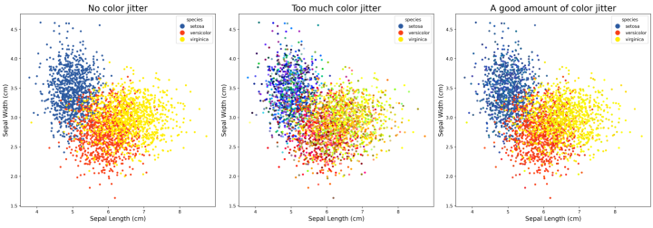
Recall that, with traditional positional jitter, if the range of jitter is small relative to the offset of the categories, we’re not confused about which group any point belongs to. Similarly, if the base colors we use to define categories are well selected to be perceptually distinct, then the subtle color jitter within categories doesn’t confuse the viewer as to which group an individual point belongs to.
We can therefore have the best of both worlds: a wider range of colors to enhance discriminability, while still being able to use color to know which point is from which category. The constraints are the same as with positional jitter: too little and the points all look the same, too much and we negate the encoding entirely.
I’ve been using color-jitter in almost every project for several years now. I’ve found it useful whether plotting points, lines, or visualizing crowded 3D models. When used sparingly, harnessing randomness in color can both enhance the clarity and appeal of a visualization.

Tyler Sloan is a quantitative biologist, programmer and the founder of Quorumetrix, a scientific data analysis and visualization studio based in Montréal, Quebec. Specializing in scientific data visualization and 3D rendering, his practice integrates advanced visualization with modern motion design to present research data in a beautiful and engaging way, while maintaining robust scientific accuracy. His award-winning visualizations have been featured in prominent academic journals and conferences. Although he specializes in neuroscience, Tyler embraces a generalist approach, loves the challenge of exploring new data types, and he is particularly passionate about immersive, full-dome visualization. He is always open to new clients, collaborations, and professional representation.